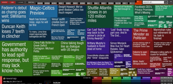
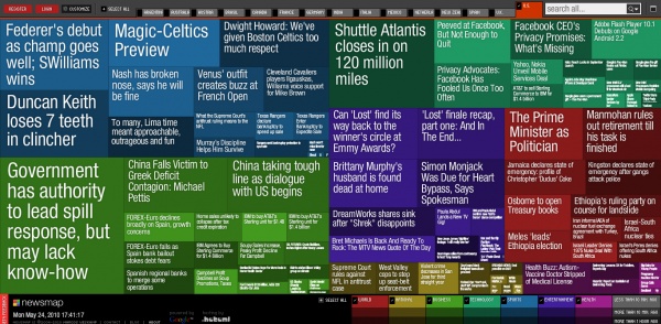
If you’re looking for a new, better way to see your news, consider newsmap. This fun little piece of web work aggregates all the news coverage from a given country (choices range from Argentina to the United States), and displays it visually. Similar news items that are the most frequently linked, reblogged, or otherwise covered, are given a larger block of space on the frontpage, while lesser items are given less space. A very interesting way of seeing how news is covered, and what is covered.

Leave a Reply